
.avif)
Since launching buildwithfern.com, we have fielded countless questions about how we built it. In an age where AI-generated sites are becoming the norm, creating something polished and intentional takes attention to detail and critical feedback. Here’s how we did it.
TL;DR
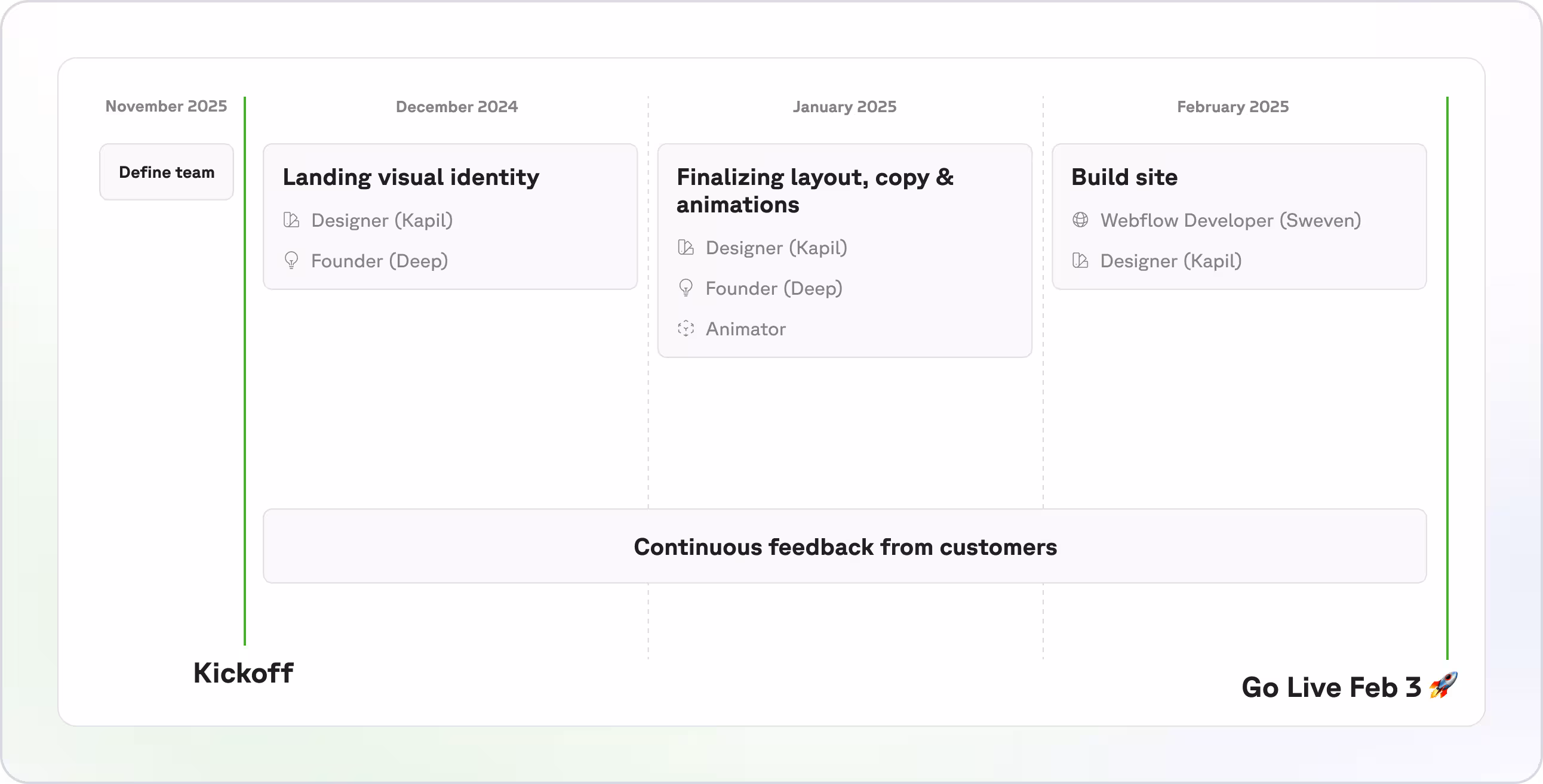
- Launched buildwithfern.com with 3 months of iterations and polish
- 1 month of landing visual identity
- 1 month of copy refining, defining animations, flourishes
- 1 month build with constant refining of the above
- Feedback is non-negotiable. Collect feedback early and often. Every week we got input from teammates, customers, or friends that informed our design.
- Quality takes $. The entire effort cost us roughly $85K.
- $50k Contractors: Design + Animation + Webflow Developer
- $20k of a FT Fern employee (Deep)
- $15k Brand Identity: Early brand identity established by Basement Studios.
- ~$500 Software Budget: Webflow + Figma + Rive
- Involve a Founder or Early-Employee. Every founder has an intimacy with their product and customers but Deep
- Follow me on X and DM me for the full Figma file.
Now let's get into it...
Team Responsibilities
- Product Designer (Myself): Shaped the layout, design identity, and language of the site.
- Animator (Friend of Fern): Worked on the hero animation in Rive.
- Webflow Developer (Darren Harroff): Turned designs into a live, functional site to move quick. Darren, from Sweven, built the scaffolding (more on this later) of the home page within 2 weeks and set us up for success to build the rest of the pages out. We cannot recommend Sweven enough at Fern.
- Founder (Deep Singhvi): Every founder has an intimacy with their product and customers but Deep is unique in his ability to sweat over the details that matter. He was instrumental in the copy. He offered feedback every step of the way but let design stretch from there. We enjoyed working together so much, I joined the team!
Layout & Theme Revisions
Building the site was a hands-on, iterative grind. Here’s how we pulled it off:
We didn’t guess what worked — we asked. Customer feedback drove daily tweaks to layouts, ensuring the site spoke directly to our audience. At Fern, we’re fortunate to have a Slack channel with every one of our customers. We leveraged these Slack channels to get realtime feedback.
This feedback led to a total of 4 full iterations, highlighted below with the corresponding feedback we received that shifted our direction.
Baseline — Identify the Goals & Non-goals
We felt the current site did it's job communicating Fern’s value to the world — but it fell short in a few key ways. We analyzed the complete site and set ourselves goals & non-goals.
💡 Goals
- Create a site that reflects the polish of our product. Customers regularly told us they were surprised by how refined our SDKs and docs were. We wanted the new site to feel like a digital handshake: a signal that we sweat the details.
- Clearly showcase Fern’s 2-in-1 product story. Fern is unique in that one platform powers both your SDKs and your interactive Docs. We needed that value prop to shine throughout the site.
- Move to Webflow to enable faster iteration. We wanted to maintain a truly unique site, without relying on engineers. Moving to Webflow from Framer allowed us to do so.
💡 Non-goals
- A full brand refresh. We weren’t trying to rethink the logo, name, or color palette.
- Rebuild how we market Fern from scratch. This was an evolution, not a reinvention. We already had a strong product narrative — the goal was to express it more clearly and confidently.
A deep dive into how the previous site fell short:
Iteration 1 - Find a theme we loved
We kicked off a design sprint by rapidly designing variations of our hero section. We focused on speed, visual elements, copy, and layout. The goal was to land in a direction that we can continue to explore.
We referenced the following sites for inspiration on design, UX, and execution: Framer, WorkOS, Pylon, Clerk, Attio, Vercel, Antimetal, Retool, and Linear. They inspired us to aim higher and sweat the small stuff.


💡 Here’s what we learned from all those explorations:
- We need to show — not just tell — what
fern generateactually does. Within a few seconds, visitors should get it: one command powers both your SDKs and your docs. That means:- Support for all major specs (OpenAPI, gRPC, AsyncAPI, etc.)
- SDKs generated in TypeScript, Python, Go, Java, C#, PHP, Ruby
- Fully branded, interactive API docs
- Our customers are our best advocates. We’ve been lucky to work with some of the best API-first teams out there — and they deserve to be above the fold. Not just logos, but real outcomes and impact.
- Structure matters. Everything below the hero should walk through the product suite clearly: first the 2-in-1 story, then the breakdown of SDKs and Docs with all the bells and whistles. No fluff — just clarity and value.

Iteration 2 - Skew vs Flat-lay
At this point, we had a solid foundation to explore the full-page layout. We leaned into a dark mode theme with a flat-lay grid and a skewed perspective — a visual direction we were excited about internally. But we knew that wasn’t enough — we needed to gut-check it with real users.
So we shared both mocks with our customers and asked for candid feedback.

Boy, did we get feedback! We got immediate thoughts via our various Fern x Customer Slack channels.

💡 Overall, our existing customers loved it — it had the polish we were aiming for. But it didn’t quite land with the potential buyers we were targeting. Several folks pointed out that the dark mode felt too playful and didn’t carry the enterprise-level credibility we needed to convey.
Iteration 4 - Switching to light mode
We weren’t totally sold yet — the dark mode mockups had gotten a ton of love. But to be sure, we quickly put together a few light vs. dark variations and started sharing them around. We kept it lean, and just mocked up the hero section to move fast.

💡 The numbers spoke for themselves — after polling 17 customers, it was clear: light mode was the favorite with 14/17 folks preferring it.

Iteration 5 - Polish
Once light mode became our guiding north star, we felt free to explore the rest of the page. We mapped out every section — sections, components, structure — and laid it all out. Looks gnarly in the zoomed out view.

A few of my favorite site moments:
Docs Intro Animation
While jamming one day, Deep and I knew we had to highlight this specific quote from Vic Plummer (DX Relations at Webflow):
“We partnered with Fern for SDKs, and after seeing their docs platform, it was a no-brainer to expand.”
We’d seen a beautiful quote-driven animation on Attio’s site that set the tone right out of the gate — and it inspired us. We thought: what better way to introduce Docs than to stage it like a curtain reveal at a theater?
So, we designed an animation that literally closes the curtains, flips the lights to dark mode, and reveals a series of stunning docs sites — each custom branded. It turned out even better than we expected. Check out the frames below and the final result.

SDK & Docs Feature Cards
We struggled at first with how to best showcase SDK features — it’s tricky when everything is so code-heavy. Eventually, we landed on a simple but effective idea: overlaying each code snippet with the end result a customer would actually see. It sounds obvious in hindsight, but getting the visuals right took hours of iteration. I’m proud of the details we packed into both the SDK and Docs feature cards. Here are a few of my favorites:

SDK Generation Code Snippet
This was particularly hard to design and iterate on because the code was unique per each language. I spent time with our SDK expert — Alex McKinney to doc each language and then used Cursor to animate what an output can look like.
We love Back to the Future at Fern and referenced it for each snippet animation. Check them out.
Hero Animation in Figma
The final step was to nail our hero animation that would show above the fold. We started by storyboarding it in Figma before bringing any frames to life.
Check out an example of the full animation frames we delivered to our Rive animator.
[Image to come]
The final animation? It’s genuinely a joy to watch — and in just 10 seconds, it showcases the full breadth of what Fern can do. Our animator knocked it out of the park with the subtle expanding of cards and pulsing of strokes.
Building The Site — Two-Week Webflow Sprint & Adding Remaining Pages
Our Webflow developer, Darren, hit the ground running. We were meticulous with our Figma handoff — font sizes, colors, spacing, annotations. We gave him as much as we could.
And Darren took it even further. He iterated non-stop for two weeks, dialing in every detail: hover states, animations, responsiveness — the works. Here’s where he helped:
- Set up a client-first class system
- Built the complete home page
- Set up the Webflow-based animation for introducing Docs
- Advised using Relume components
After his sprint, I jumped in to bring the rest of the pages (pricing, customers, blog) into the Webflow build. I reused a ton of what Darren had already laid down, and honestly, we couldn’t have hit our deadline without him.
Launch 🚀
We launched on February 3rd after our offsite (we had a bug bash in Costa Rica!) and since then have seen nearly a 2x in page views. And of course the details paid off! Here are a few notes from our customers and friends that made the work all worth it. Go check it out!
.avif)
To Continue
Launch isn’t the end. We’re already eyeing upgrades to our customer pages and blog, pushing to keep the site as sharp as our product. Lots of exciting things coming soon.
Action Items
- Visit buildwithfern.com and poke around. See the details for yourself.
- Tell us what you think — your feedback fuels the next round of improvements. DM me on X.
- It’s not just a website — it’s a testament to how much we care about craft at Fern. If you feel similarly about devtools come join us! We’re hiring across the board and recently raised our Series A.
🎁 Lastly, give me a follow on X and DM me, I'll send over the full Figma of our website designs.
.jpeg)


.png)

.png)