TLDR: Fern's technical writer, Devin, maintains 500+ pages of documentation for Fern Docs and SDKs, with new features shipping daily. Every time a page needs updating, the content is the obvious part — the components underneath it are the editorial decision most writers don't revisit.
Every page I publish immediately starts evolving: the feature it covers changes, customers ask questions, edge cases emerge. This is how documentation is supposed to work, but it's also the central challenge of maintaining it.
When I add new information to an existing page, I usually end up reworking whole sections if not the whole thing — combining sections, tightening prose, reorganizing the flow so the new content fits. But there's also the question of whether the components on the page still fit. The callouts, accordions, tabs, and parameter fields that shape how a reader moves through a page aren't decisions you make once at publish. As content shifts, components should shift too.
Here are three pages I've recently rebuilt and what drove the rebuild each time.
A page that grew with the feature
Our llms.txt page covers how Fern automatically generates llms.txt files for your documentation site. These are structured Markdown files that let AI tools like ChatGPT and Claude discover and index your docs.
The first version of this page was minimal because at that time, the feature was minimal too. The page contained a brief explanation of what llms.txt is, bullet-point summaries of the two generated files, and a couple of example links. That was appropriate — the feature was new, the page was short, and there wasn't much to configure.
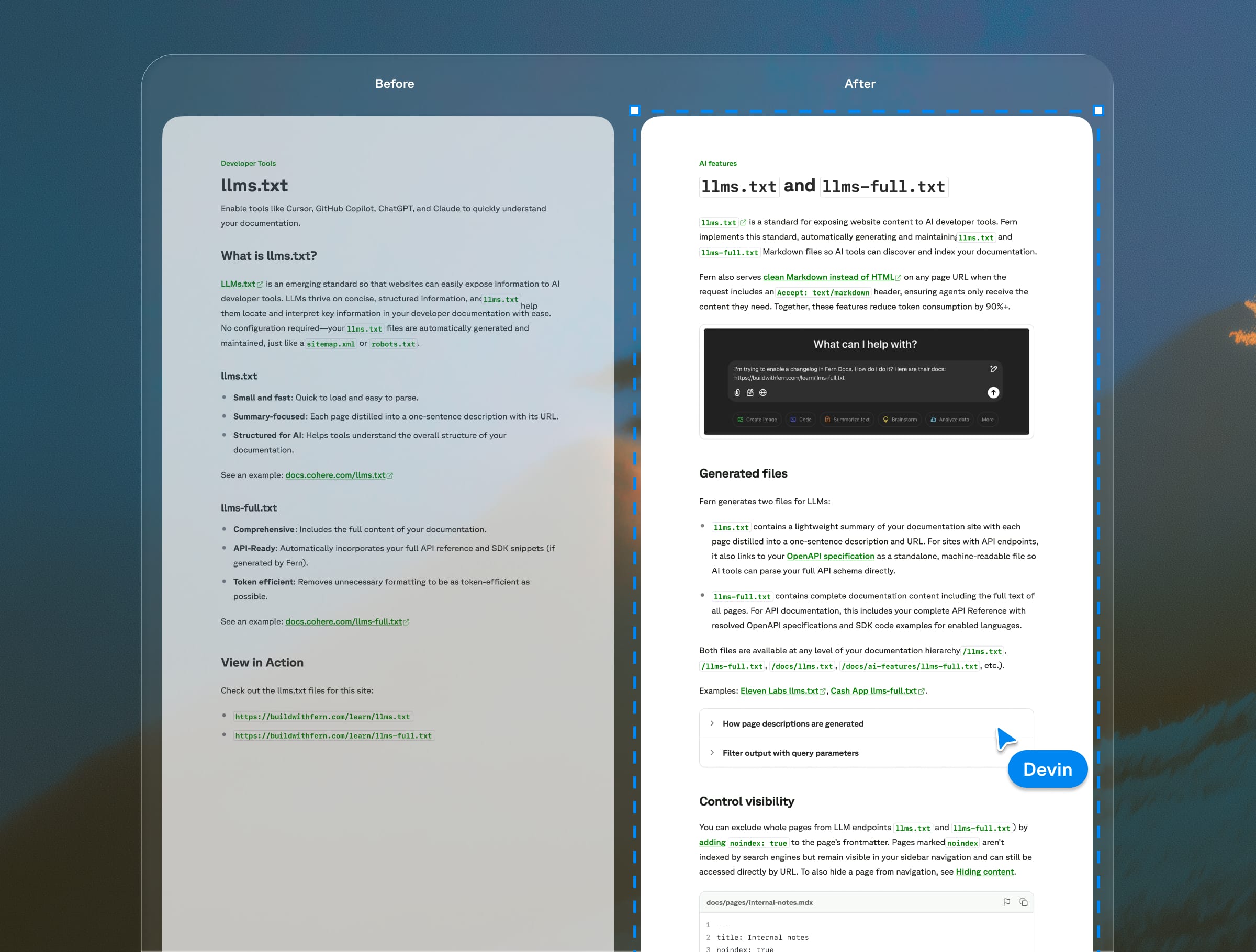
But the feature expanded over time. We added query parameters for filtering by language; visibility controls with <llms-only> and <llms-ignore> tags; dashboard analytics; and ways to surface llms.txt directly in navbars and SDK docs. Each addition was small on its own, but the page was steadily getting longer and flatter.
I added structure gradually, and sparingly. I condensed some older sections into a tighter intro. I added components: Accordions for query parameter details and integration patterns that aren't relevant to every reader. Tabs to distinguish between output formats. ParamFields for the lang and excludeSpec parameters. Code blocks multiplied as the features they documented came into existence.
No single change was dramatic, but compare the original to the current version, and the page reads completely differently. The core explanation is still clean, and the details that only some readers need are accessible but not in the way.
A page that outgrew its pitch
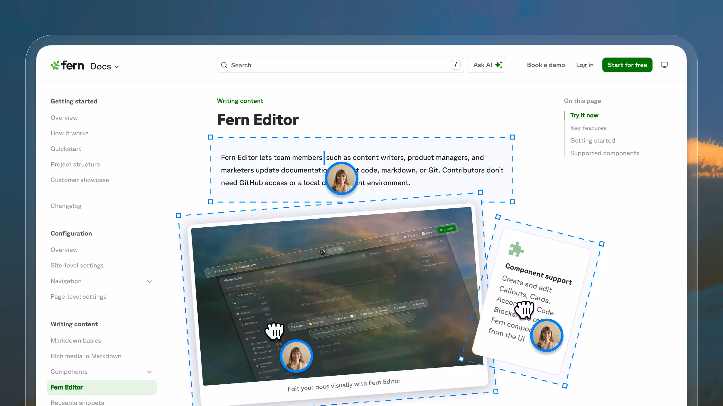
Our Fern Editor page covers Fern's WYSIWYG editor, a browser-based tool that lets non-technical teammates update documentation without touching code, markdown, or Git.
When the Editor first launched, the page needed to do a lot of work. It was introducing a brand-new feature, so it had to explain what the Editor was, showcase everything it could do, and address the questions customers had been asking. It led with a six-card grid of key features (including beta labels on features still in progress), followed by an eight-item FAQ covering everything from browser support to how to add users to an organization.
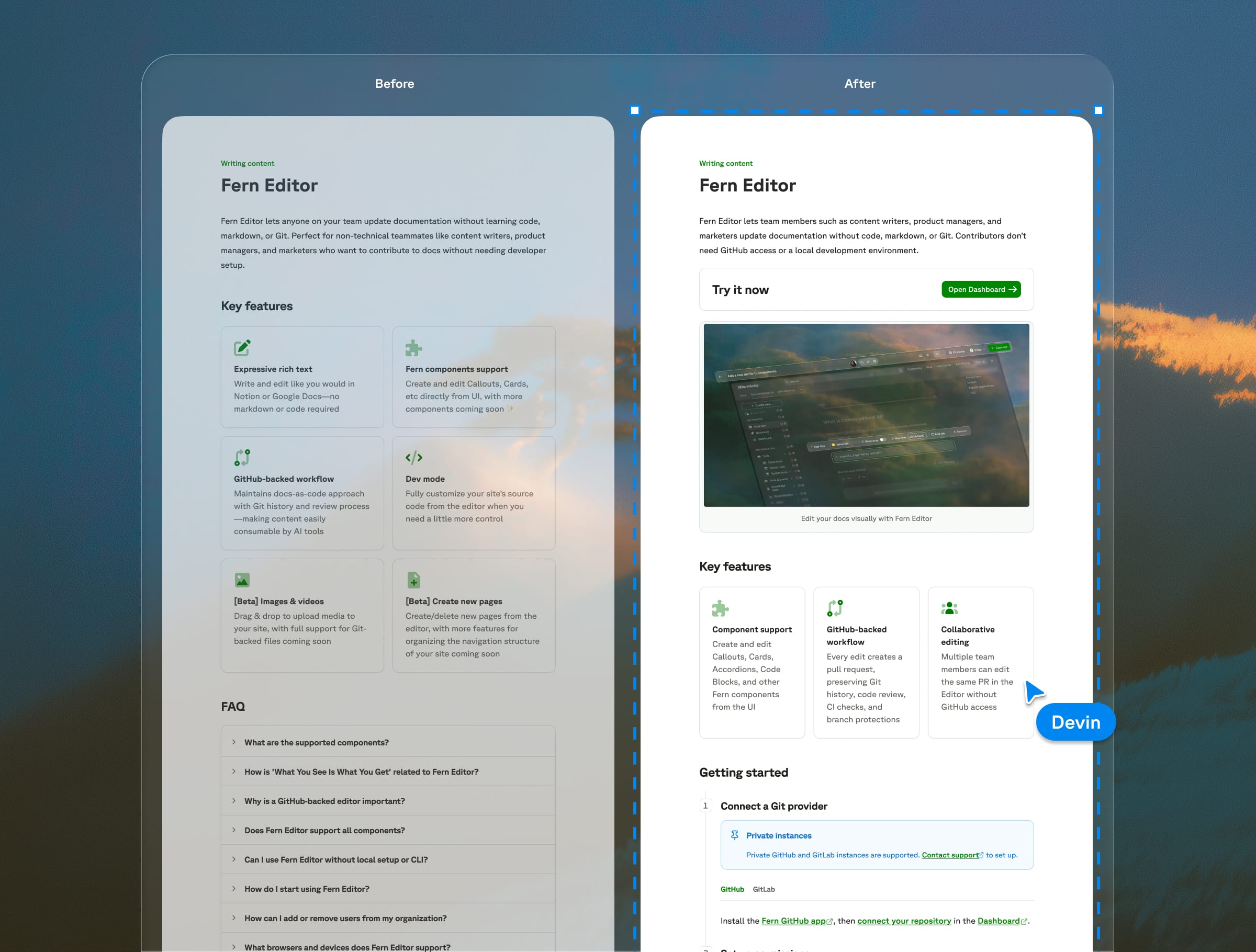
That made sense at the time. The page was part documentation, part pitch, because it needed to build confidence in a feature most people hadn't tried yet. As the Editor became more established, though, the page didn't need to sell as hard. The value proposition was more familiar, and customer questions shifted from questions about what the product was and why they would need it to questions about how to set up.
So I reshaped it. I cut the card grid from six to three, integrating much of the content into the intro or setup sections. I broke apart the FAQ, which had become a catch-all for setup instructions, component support details, and general questions. Most of what it contained either became part of the documentation flow or turned out to not need its own answer. FAQs are one of the most common patterns in documentation and one of the most misused — if users need an FAQ to understand your docs, the docs often need restructuring.
The page still has plenty of structure — cards, steps, tabs, a table, callouts — but it's serving a different purpose now. Instead of primarily showcasing features, it's now guiding someone through setup.
A bare page that joined a pattern
The original Go SDK publishing page was three numbered steps in plain text with a couple of links. Go publishing really is that straightforward, but there was missing context around prerequisites and configuration, and the page was so short that it almost looked like a mistake.
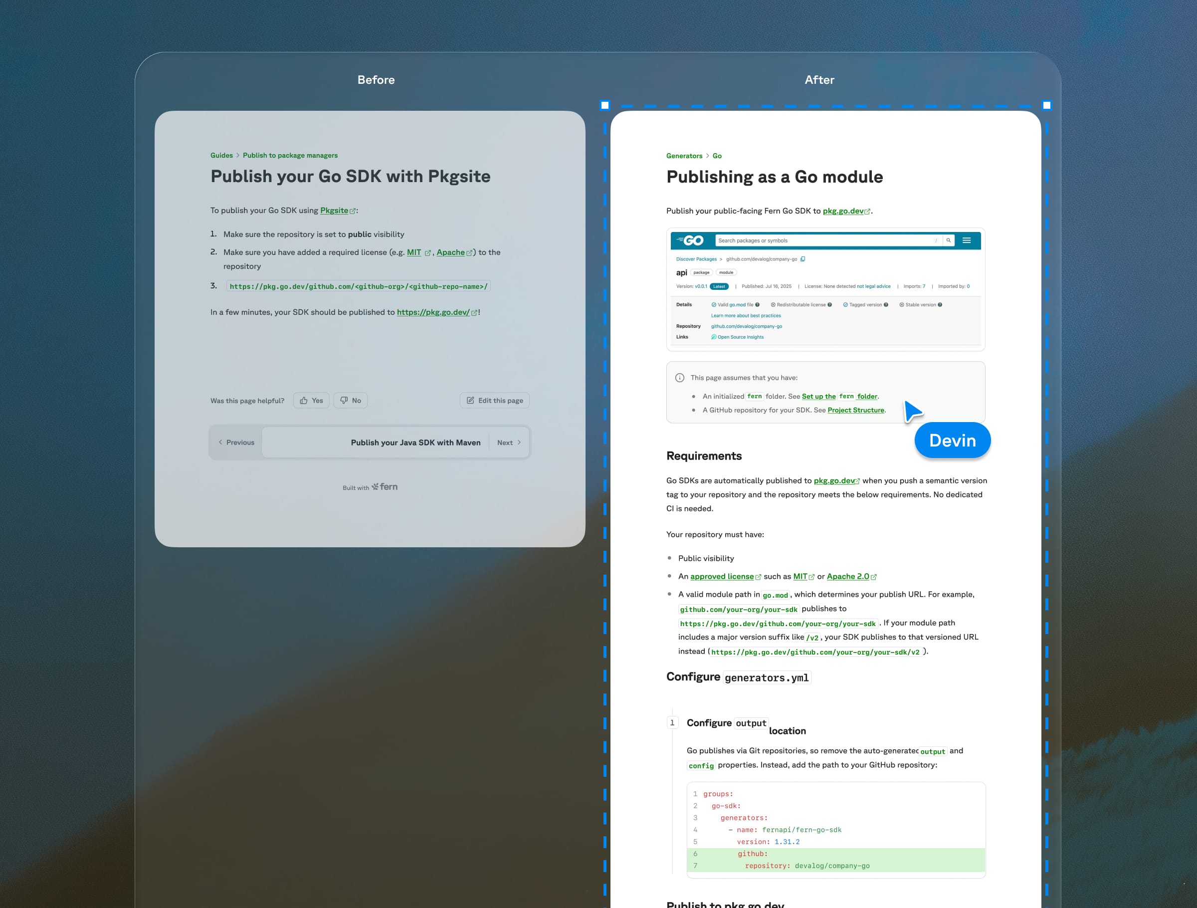
The actual process of publishing a Go SDK to pkg.go.dev hasn’t changed, but I fleshed out the page with some additional context and configuration details based on customer feedback and confusion.
More importantly, the page now looks like it belongs in the docs. Fern supports SDKs in nine languages, and over time I've revamped all nine publishing pages to follow roughly the same flow: a callout with prerequisites, stepped instructions with code blocks, and consistent visual structure across the set. The Go page uses this shared structure as a guide, though I intentionally didn't expand the content just to fill the template. The page is short because Go publishing is short.
Components on procedural pages like this one are primarily about making individual pages readable. But they're about building patterns that scale — for readers and agents moving between pages, for writers creating new ones, and even for AI drafting new guides from established templates.
Components serve the page, not the other way around
AI still isn't great at integrating new information into existing content, especially when that information requires some restructuring or reframing of what's already there. Ask Claude to add something to a page, and it'll often default to adding a new thing — a new step, a new section, a new callout — rather than weaving the information into what already exists. It'll add a callout where it should have rewritten the first sentence of step 1. It'll add a new section where it should have updated the closing line of the page intro. It'll tack on a note where it should have folded the information into an existing paragraph and restructured around it.
And when AI does reach for structure, it reaches for components — callouts, accordions, tabs, step lists. That instinct isn't wrong, just overcalibrated. Components are one of the most important tools for making documentation readable. Documentation without them can be hard to scan and navigate, plus it doesn't help someone gain trust in your product. The skill is knowing when components are earning their place on the page and when they're just adding clutter.
When I add a new piece of information to a page, I first evaluate whether it can fit into the existing structure well. Sometimes it's just a matter of expanding a single step in a tutorial, or adding an additional card to a section. Other times, I need to reconfigure things more — condense a callout into an intro paragraph, move a section into an accordion, or add tabs to a step.
Consistently structured pages help both humans and AI tools navigate your docs. Humans scan faster when pages follow recognizable patterns. For AI — particularly search and retrieval tools — clear structure makes the relevant chunk easier to isolate. When a user asks an agent a question and the answer lives inside a well-labeled callout or a clearly scoped accordion, that agent is more likely to surface it cleanly than if the same information is buried mid-paragraph. But that consistency only works when a human has made the judgment calls — what to emphasize, what to tuck away, and when a page's job has changed enough that its structure needs to change too. Components make structure visible, but someone still has to decide what that structure should be.